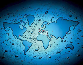
“I speak to maps. And sometimes they something back to me. Before maps, the world was limitless, but maps made places on the edges of the imagination seem graspable and placable.”
- Abdulrazak Gurnah, By The Sea
But so much of cartography is socially-constructed, not just cold geography. Who made the map, where were they from, what do they believe, who have they conquered, how do they see themselves in relation to the rest of the world? These are the real questions about any map that you won’t find clarified in its legend. Pondering the absolutism of a map leads us to question everything else in our lives, even gravity and the laws of physics, but never grants us comfort in our own infinitesimal mortality – if anything we're gently reminded of the Reaper at the door every time we unfold a map.
“Two important characteristics of maps should be noticed. A map is not the territory it represents, but, if correct, it has a similar structure to the territory, which accounts for its usefulness.”
- Alfred Korzybski
Therefore maps are, at their essence, nothing more than snow globes - they depict a scene of the world frozen in time but when turned upside down, prodded a bit, and shaken vigorously a dynamic story emerges, the story of humankind.
***
I want to share with you 20 maps that helped me view our big, beautiful, infinitely fascinating earth from a new vantage point. I hope they make you think about the world differently, as they have for me.
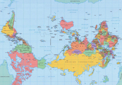
1. Lets start with a 100% accurate map of the world that you probably have never seen. The Northern Hemisphere is always “up” on the map. The practice stems from European map makers who used the North Star as a point of reference on their maps.
That is completely arbitrary – “up” and “down” do not exist on a perfect sphere rotating and floating through directionless space.
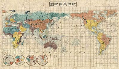
2. On most maps we see North America and Western Europe centered or featured when viewed left-to-right, because we read text, see pictures, and view maps left-to-right, top-to-bottom in the West. But when we look at this ancient Japanese-drawn map, Asia is almost perfectly centered.
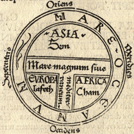
3. Before the expansion of European colonialism, East was often “up” or featured on maps, hence the word “orientation,” (which comes from the Orient.)
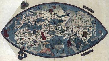
4. Even the shape of the world changes how we see things - a map when the world was thought to be flat.
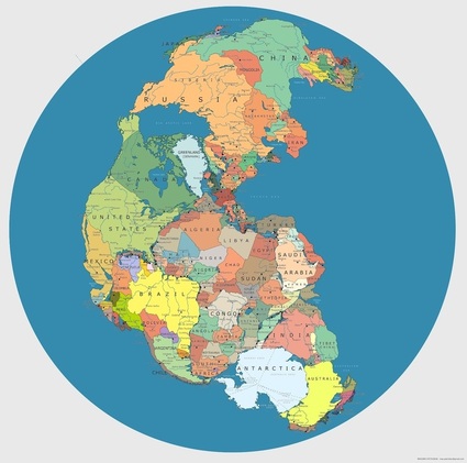
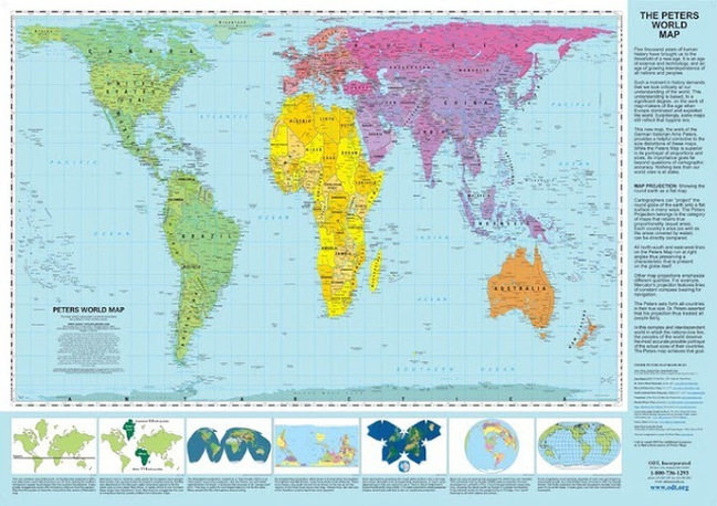
5. Map of countries conjoined to show their true relational size, as if a modern-day Pangea existed.
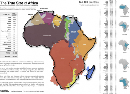
6. To put Africa’s size in perspective, we could fit the land masses of the United States, all of Eastern Europe, Italy, France, Spain, Germany, the United Kingdom, India, Japan, and inside of it.
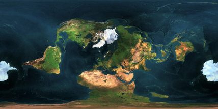
7. Perspective is everything - like we can see in this map of the world from the vantage point of the North Pole.
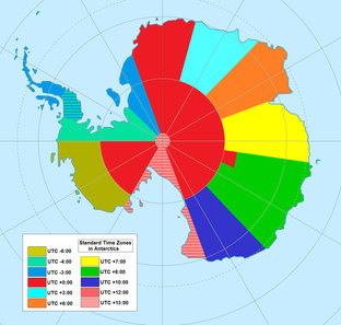
8. Longitude and latitude can be deceivingly hard to visualize on a map, as illustrated by this map of time zones in Antarctica.
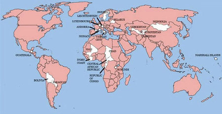
9. He who conquers, writes the history. We can trace the reach of Colonialism with this map of all the countries Britain invaded at some point.
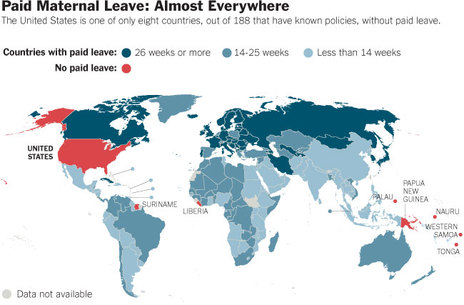
10. We can even track social issues via maps, like countries that offer paid maternity leave, framed in perspective to the rest of the world. Note that the United States is on par with Suriname, Liberia, Palau, and a few Pacific Island nations in it’s refusal to offer standard paid maternity leave.
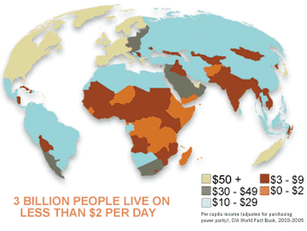
11. Or a map of the world according to who makes under $2 a day, a barometer for desperate poverty.
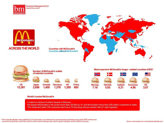
13. If we want to investigate the power of corporate influence in the world, we only have to peek at this map of countries who have McDonalds. That corporation is, in fact, the largest private land owner in the world outside of the Vatican City.
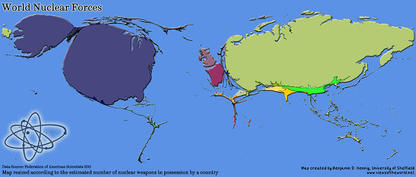
14. Another way to graph our world is to resize nations according to certain factors, like this map that portrays size according to possession of nuclear weapons.
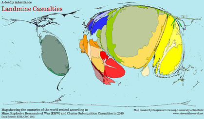
15. For instance, an issue that isn't even on most peoples radar is unexploded land mines. They're a HUGE problem in many war-torn countries, because obviously the mines don’t just disappear once the conflicts are over – they sit in the ground unexploded for many decades, often detonating on unsuspecting farmers and especially children.
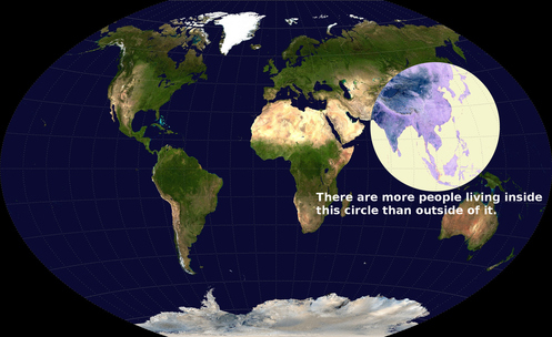
16. Maps can shed a light on the dynamics of how we exist, like this map of the concentration of population in the world. There are more people living inside this circle – in India, Indonesia, southeast Asia, and China, etc., than are living in the whole rest of the world combined.
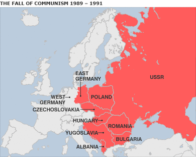
17. Maps can be redrawn with startling quickness, like this map of a changing Soviet Union and Eastern Europe during the fall of Communism, between 1989-1991.
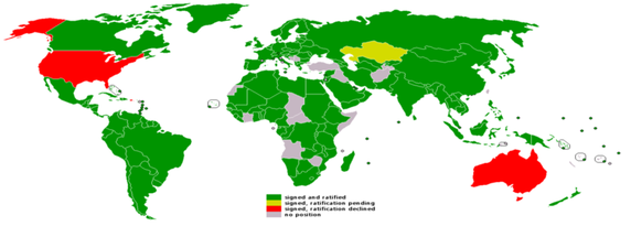
18. Maps can also show us a clear ripple effect of our policies, like this map of the countries who have not signed the Kyoto Protocols, a 1997 United Nations agreement to lower the environmental impact of greenhouse gases.
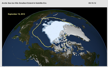
19. And how the polar ice caps have shrunk more in the last 30 years than all of modern history previously due to global warming and climate change.
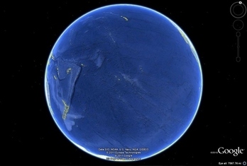
20. When we look at this photographic map of the Pacific Ocean from outer space, we realize that in the cycles of birth and death on this planet, in the span of time, and in the vastness of the cosmos we barely exist at all.
Ultimately, maps remind us that the there are as many ways to view the world, as many opinions on reality, as people beholden to it.


 RSS Feed